As we slip from crisp autumn afternoons into the glow of holiday lights, designers face a familiar brief: keep the warmth of fall while hinting at celebration. The most effective November palettes and patterns do exactly that—grounded, tactile bases from autumn; luminous, jewel-like accents for festive lift; and a few strategic textures that feel seasonal without being bound to a single holiday. Here’s a concise, field-tested guide you can apply to banners, hero images, packaging, social templates, and retail environments today.
1) Start with a cozy neutral anchor.
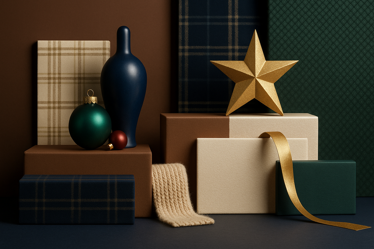
Pantone’s Color of the Year 2025, Mocha Mousse (PANTONE 17-1230), is a warm, sensorial brown that instantly reads inviting and premium across print and digital. Use it as your primary base in backgrounds, type blocks, or product staging; it carries autumn’s comfort while staying elegant enough for gifting season. Pair it with pale creams and bone whites for copy legibility and quiet luxury. Pantone+2Pantone+2
2) Add a modern dusk note for depth.
Forecast leaders WGSN + Coloro called Future Dusk—a blue-violet between navy and purple—the 2025 mood color. As an accent, it gives November visuals sophistication without tipping winter-cold. Try it in gradient shadows, nav bars, or secondary CTAs to bridge pumpkin-spice warmth and night-market sparkle. WGSN+1
3) Layer jewel tones like accessories.
To foreshadow festivities, introduce restrained hits of emerald, sapphire, and ruby—thin rules, ribbons, button hovers, foil edges, or micro-icons. These gemstone notes communicate holiday energy while remaining tasteful when applied sparingly. Interior style press this season highlights the comeback of these saturated jewels—proof that a little goes a long way. Real Simple
4) Embrace “quiet-holiday” whites and metallics.
If your brand skews minimal, build a white-on-white or soft-neutral canvas, then elevate with texture (paper grain, linen, frosted blur, matte-gloss contrasts) and subtle metallics (champagne, pewter, antique gold). This achieves calm, gallery-clean layouts that still feel celebratory—an approach spotlighted in current minimalist holiday styling. Homes and Gardens
5) Choose patterns that read both fall and festive.
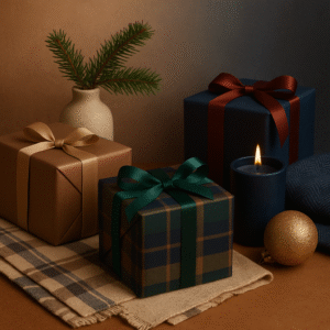
- Plaids & tartans (black watch, windowpane, buffalo check): timeless, gift-ready, and instantly seasonal without specific iconography. Use as overlays at 8–15% opacity behind type, or as masked edges on cards and buttons. Retail trend coverage shows tartan and gingham carrying holiday floor sets in 2025. Southern Living
- Menswear textures (tweed, herringbone, pinstripe): great for “heritage luxe” brand cues. Convert to vector hatch patterns or noise textures for web-friendly performance. Trend reporting from High Point notes tailored fabrics and moody palettes aligning with this look. House Beautiful
- Gingham & mixed prints: for playful brands, small-scale gingham with stripes or micro-florals creates characterful, layered visuals that still feel cozy. Keep scale subtle so it supports, not competes with, messaging. Homes and Gardens
6) Let gradients, grains, and metallic sheens do the seasonal lifting.
Graphic-design outlooks for 2025 call out gradients, textured grain, and metallic accents—tools that can softly transition a palette from day to dusk, harvest to holiday. Try mocha-to-dusk gradients for backgrounds, grain overlays to add tactility to flat color, and micro-metallic UI accents (icons, dividers) for a festive wink. Digital Synopsis+1
7) Build a November-to-Holiday palette in three tiers.
- Base (70%): Mocha Mousse, cream, bone, charcoal.
- Depth (20%): Future Dusk and/or navy-plum notes.
- Spark (10%): Emerald/Sapphire/Ruby, plus champagne metallic.
This 70-20-10 split keeps assets cohesive across weeks: start with mostly base + depth in early November, then gradually increase the spark tier after mid-month for promotions and gifting campaigns. Pantone+2WGSN+2
8) Content & layout tips for real projects.
- Email & banners: Use a plaid keyline or ribbon strip (2–4px) over Mocha grounds; animate a faint gradient shift toward Future Dusk on hover.
- Social posts: Carousels: tile a menswear texture on Title slides; swap to jewel-tone solids for Offer slides.
- Packaging & print: Specify uncoated stocks with embossed herringbone, then foil a single emblem in champagne—premium, not loud.
- Web hero: Soft white canvas with grain; product on mocha plinth; micro-confetti of sapphire dots at 10% opacity for festive motion that doesn’t steal focus. (Metallic UI accents align with current trend roundups.) Adobe
9) Why this works in early November.
Consumers aren’t ready for full tinsel yet. Warm browns align with comfort and “deliciousness,” while cool dusk tones and restrained jewels signal what’s coming—glamour, gatherings, gifting—without forcing a holiday motif too soon. This balance dovetails with broader 2025 sensibilities: quiet luxury, tactility, and a shift toward layered but refined visuals. TIME+1
Index of sources (with links)
- Pantone — Color of the Year 2025: Mocha Mousse (17-1230): https://www.pantone.com/color-of-the-year/2025 Pantone
- Pantone — Media kit / product pages for Mocha Mousse: https://www.pantone.com/color-of-the-year/2025/media-kit Pantone
- TIME — Why Mocha Mousse Is Pantone’s 2025 Color of the Year: https://time.com/7199819/why-mocha-mousse-pantone-2025-color-of-the-year/ TIME
- WGSN + Coloro — Colour of the Year 2025: Future Dusk: https://www.wgsn.com/en/blogs/introducing-our-colour-year-2025-future-dusk WGSN
- Architectural Digest — Future Dusk will be the 2025 Color of the Year (WGSN/Coloro): https://www.architecturaldigest.com/story/future-dusk-will-be-the-2025-color-of-the-year-according-to-coloro-and-wgsn Architectural Digest
- Real Simple — Holiday 2025 décor: emerald, sapphire, ruby: https://www.realsimple.com/holiday-decor-trends-2025-11840358 Real Simple
- Homes & Gardens — Minimalist white holiday styling (quiet luxury): https://www.homesandgardens.com/interior-design/joanna-gaines-white-christmas-living-room-trend Homes and Gardens
- House Beautiful — Menswear-inspired textures at High Point Fall Market: https://www.housebeautiful.com/design-inspiration/a69208903/menswear-inspired-home-trend/ House Beautiful
- Homes & Gardens — Pattern mixing (gingham, stripes, florals) in 2025: https://www.homesandgardens.com/celebrity-style/amy-sedaris-gingham-pattern-trend Homes and Gardens
- Adobe Express — Graphic design trends 2025 (metallics, textured grains, shapes): https://www.adobe.com/express/learn/blog/design-trends-2025 Adobe