As we move into the heart of autumn, October brings a distinctive palette and pattern mood that’s both familiar and refreshed — perfect for marketing design, branding projects and seasonal campaigns. Let’s explore what’s trending in colors and patterns this October, and how you can apply them in creative, intentional ways.
Color Mood: Earthy Luxe Meets Bold Accent
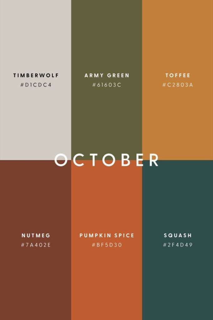
This season’s color story for October is built around rich neutrals plus accent hues that feel elevated rather than predictable.
- Chocolate/Deep Brown: Designers and trend reports highlight chocolate brown as a strong neutral this fall. It is replacing plain black and acts as a warm, sophisticated base. Glamour+1
- Amber, Pumpkin & Rust: Classic autumnal shades — amber waves, pumpkin spice, burnt orange — are being re-imagined with depth and richness. Harper’s BAZAAR+1
- Plum, Burgundy & Deep Purple: Jewel-toned purples have become key accent colors—luxurious and dramatic when paired with brown or camel tones. Harper’s BAZAAR+1
- Olive, Forest & Fern Greens: Earthy greens continue to provide a grounding counterpoint to warmer hues — ideal for blending, layering, and giving a natural feel. Jo-Lynne Shane’s Blog+1
- Unexpected Pops: Subtle surprises like icy pastels, muted blues or even mint greens are quietly making their way into the mixed contrast or surprise in a controlled palette. Harper’s BAZAAR+1
For a marketing design mindset: consider using a rich neutral (like chocolate brown or deep green) as your base, then accent with a bold seasonal hue (pumpkin, plum) for impact. That gives you a palette that feels both relevant and premium.
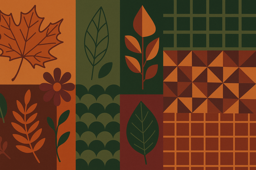
Pattern Trends: Familiar Structure + Fresh Expression
The patterns accompanying these color stories are doing double duty: they pay homage to timeless motifs while being reinterpreted for a modern, design-forward audience.
- Plaids & Checks: A perennial autumn standby, but this year with refreshed scales and color combinations — think olive or brown plaid mixed with autumn accent tones. thedesignagent.com
- Stripes (bold and subtle): From sporty broad stripes to refined pinstripes, stripes are now a versatile pattern for everything from outerwear to stationery and visuals. thedesignagent.com
- Geometric Shapes: Clean lines, abstract shapes and retro-inspired geometry (70s nods) are showing up in print, pattern and digital design. They add energy and structure. thedesignagent.com
- Organic Floral & Botanical Motifs: While prints reminiscent of summer blooms might fade, autumn’s florals bring heavier textures, deeper tones, and organic flow – think leaves, branches, subtle movement. thedesignagent.com
In your design service catalogue: you could position this as “Seasonal Pattern Kit – Autumn 2025: Plaid + Geometry + Organic Forms” and deliver templates or assets that reflect these trends in a branded way.
Application in Marketing Design & Branding
Here’s how you might translate these color + pattern trends into practical deliverables for clients, especially in your ITG Centro service portfolio:
- Branding & identity: Use a base rich neutral (chocolate brown, forest green) as a foundational color for logo or brand elements. Then pick one or two accent colors (rust orange, deep plum) for highlights. Add pattern-based backgrounds (plaid, geometric) subtly in collateral (business cards, letterheads, presentation decks).
- Web & social design: For social posts or email headers timed for October campaigns, choose backgrounds or overlays in warm amber or olive tones, and layer in pattern elements (striped bars, geometric frames) to give texture and interest.
- Print/promotional materials: Flyers, postcards or posters for autumn events can lean into full-pattern backgrounds (for example a subtle, muted plaid in the brand base color) with accent typography in burnt orange or plum to draw attention.
- Template & asset systems: Because you design to scale (multi-monitor setups, print plus digital deliverables, animations) build template libraries where the seasonal palette is modular. That means the client can swap accent colors or pattern layers as campaign needs shift, while underlying brand consistency remains.
- Content & motion graphics: If you’re doing motion work, a pattern transition (say, geometric tiles morphing into organic leaf shapes) matched with a color sweep from olive amber → plum creates a dynamic but coherent visual story for October-themed pieces.
Why It Matters & Why Now
October is the perfect moment for refreshed design direction because as nature shifts, audiences respond to color and texture cues that reflect seasonality. Using relevant palettes and patterns gives campaigns a timely, authentic feel rather than chasing generic visuals.
Also: clients increasingly expect design systems that are flexible, scalable and visually strategic. By incorporating these October trends into your service catalogue (as you are with ITG Centro: combining graphic/motion design and system-based deliverables), you position yourself not just as a designer but as a creative systems partner.
Tips to Make It Work
- Keep one dominant neutral in your palette to maintain consistency (e.g., chocolate brown, deep green).
- Choose one standout accent for the campaign or month (e.g., burnt orange or plum) and limit its use for maximum impact.
- Use pattern as texture not noise: ensure patterns are scaled and subtle enough to support content, not distract from it.
- Consider medium and format: patterns that look great on print may need adjustment for digital or motion.
- Test readability and accessibility: some rich or dark color combinations may reduce contrast; always check especially for web/email.
- Provide versatility: Since you build template systems, make sure the pattern layers are optional or editable (so the brand can use them now or drop them if needed).
In summary: October’s design trends are about warm, rich color foundations + pattern motifs that echo both tradition and modernity. For your ITG Centro service portfolio, this is an ideal seasonal theme to highlight — whether you’re crafting brand identities, multi-format assets, or motion graphics. Let me know if you’d like a template pack (with color swatches, pattern files, usage guidelines) based on this October trend that we can plug into your marketing/design assets.