1. Why Colors & Patterns Matter More Than Ever
Color and pattern are foundational in both industrial and graphic design—beyond mere decoration they communicate mood, brand identity, usability, and emotional connection. In a crowded visual world, the right palette and motif can help a product, interface, or environment stand out while staying relevant. Moreover, with shifts in culture (sustainability, nostalgia, technology) the trends in color and pattern are telling us something about what people want to feel and experience.
2. Big Color Trends for 2025
Here are some of the strongest color directions emerging right now:
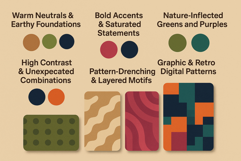
Warm Neutrals & Earthy Foundations
- The Pantone Color Institute selected Mocha Mousse (PANTONE 17-1230), a rich warm brown, as its Color of the Year 2025 — showing how comforting, grounded hues are in demand. Pantone+2wunderlabel.com+2
- Designers anticipate “warm, comforting colors” like honeyed neutrals, serene greens/blues and ruby reds will dominate. Davey & Krista+1
- Another paint-brand pick: Benjamin Moore’s “Cinnamon Slate” — a heathered plum-brown — emphasizes sophisticated yet quiet color. Benjamin Moore
Why it matters: For industrial design (products, appliances, furniture) these colours communicate longevity, craftsmanship, warmth. For graphic design, they offer a break from hyper-bright digital palettes and make things feel “real”.
Bold Accents & Saturated Statements
- According to a branding analysis: bold colours like red, mustard/yellow, aquamarine are very popular in 2025 branding work. Looka+1
- Fashion-inspired trend reports point to “wispy pink”, “moody plum”, crisp blues as key colors for Spring/Summer. Vogue
Why it matters: These colors are perfect for grabbing attention in packaging, branding, signage or limited-edition industrial products. They offer a modern edge when paired with more subdued bases.
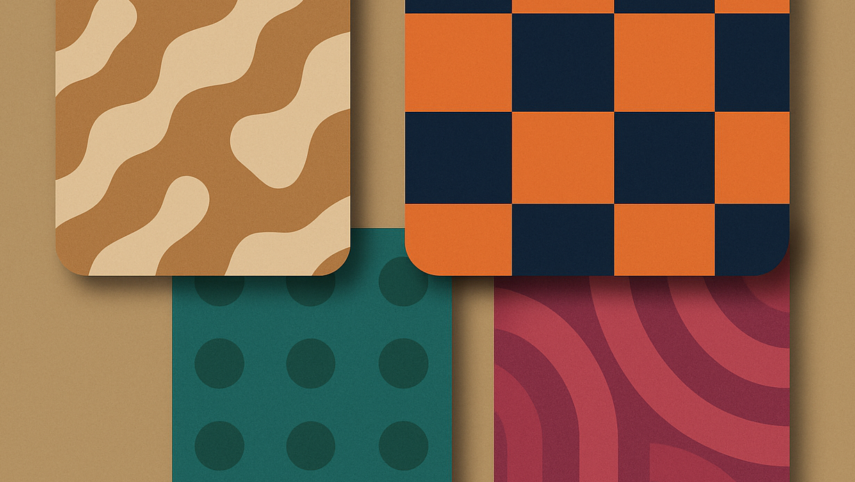
High Contrast & Unexpected Combinations
- Designers expect striking combinations (e.g., dark blue + neon orange) to gain traction. Bedance
- Emphasis on rich jewel-tones, intense hues, rather than purely pastel or muted. Better Homes & Gardens
Why it matters: High contrast palettes increase readability, visual impact and help a brand or object “pop” in digital or physical contexts. For production, this might mean contrast accents in material finish, or graphic overlays.
Nature-Inflected Greens and Purples
- An interior design source says: “purple stone interlaced with greens and oranges” is rising. ELLE Decor
- The color named “Dill Green” has emerged as a trending hue, described as “nature’s neutral”. Homes and Gardens+1
Why it matters: These colors tie into sustainability, biophilia and identity themes. For industrial design: consider green-tinted materials, or purple accents. For graphics: use muted greens or purples instead of the standard grey-blue.
3. Pattern & Motif Trends for 2025
Color alone doesn’t tell the whole story—pattern and texture are equally important. Here’s what’s trending.
A. Textural & Natural Surface Patterns
- Surface-pattern trend guides note a rising interest in “organic shapes and natural textures like woodgrain, marble, and foliage-inspired patterns”. Yes I’m a Designer
- The fold between nature and industrial is being explored: patterns that mimic stone, wood, foliage, natural dynamics.
Application: In industrial design, this can mean laser-etched textures, molded plastics with wood-grain, or graphics that use marbled backgrounds. In graphic design, layering organic patterns can add richness behind flat elements.
B. Pattern-Drenching & Layered Motifs
- The trend of “pattern-drenching” (covering walls, furniture, fabric with bold prints) is resurfacing. Homes and Gardens+1
- Another article points to bold pattern mixing: micro-stripes with oversized florals; plaids with herringbone; geometric + stripes. Homes and Gardens
Application: For product surfaces or packaging, layering two or more pattern scales (large graphic motif + fine texture overlay) can create depth. In graphic design, background patterns can interplay with typography or iconography for richness.
C. Graphic & Retro Digital Patterns
- Graphic design trend lists include “pixels”, “shapes”, “grainy textures”, “free-flowing organic shapes” as major pattern motifs for 2025. Adobe
- Surface pattern trend guide indicates a “sea-witch era” with moody ocean-inspired motifs, mysterious icons and evocations of magic/water. Elizabeth Silver Surface Pattern Design
Application: In branding, using pixel glitch textures, or water-ripple motif overlays gives a tech-meets-nature vibe. In industrial surfaces, subtle digital pattern imprints or tactile textures echoing digital motifs create novelty.
4. How to Apply These Trends: Practical Tips
Here are strategies for translating color + pattern trends into your industrial or graphic design work:
Start with Purpose & Audience
- Ask: who is this object/graphic for? What emotion or experience do we want?
- Match trend to context: A warm mocha base might be perfect for a premium product; a neon accent palette might suit a youth-tech brand.
Build a Color Palette in Layers
- Base / Anchor Color – e.g., Mocha Mousse, warm neutral, or “Dill Green”
- Accent Color(s) – e.g., cherry red, mustard yellow, saturated aquamarine
- Contrast / Highlight – high-contrast pairings like dark blue with neon orange
- Material/Finish Consideration – How the colour behaves in different materials: matte, gloss, texture.
Pattern Strategy
- Choose a hero pattern (largest scale or most visible) — e.g., bold stripes, oversized floral, large glyph motif.
- Choose secondary textures — micro patterns, grain, wood-grain, subtle geometrics.
- Consider scale contrast — hero pattern large & bold, secondary fine & detailed.
- Maintain coherence via color palette (use consistent hues) so layering doesn’t feel chaotic.
Industrial Design Considerations
- When specifying finishes, think about how color and pattern behave under lighting, wear, and materials. Earth tones help hide wear; strong accent colors draw attention but may show scratches more.
- Patterns on physical surfaces: embossing, etching, laser-cut overlays, printed decals.
- Product families: Consider offering same base color + pattern across range for brand cohesion.
Graphic Design Considerations
- Use trend colors and patterns in branding, packaging, digital UI—but make sure usability (contrast, legibility) isn’t compromised.
- For print/web: textured backgrounds (grain, marble) can add warmth behind flat UI elements.
- For motion/interactive: patterns that subtly animate (e.g., ripple, gradient shifts) tie into the tech + natural theme.
Scale & Usage Guidelines
- Trend colors/patterns should be adapted, not slavishly followed. The goal is to feel current while maintaining brand or product identity.
- Use selectively: a bold accent color or pattern on one element may work far better than saturating an entire surface.
- Always test in context: materials, lighting, scale can change perception (especially for physical products).
5. Why These Trends Are Anchored in Broader Shifts
- Comfort & grounding: The move to warm neutrals reflects a desire for connection, authenticity and stability after an era of digital overload.
- Nature & sustainability: Greens, organic patterns and textures reference biophilia, natural materials and eco-consciousness.
- Tech + nostalgia fusion: Pixel patterns, digital-retro motifs and high contrast colours reflect our hybrid digital/physical lives.
- Attention economy: Bold accents and striking patterns help designs cut through visual noise.
- Material divergence: With advanced manufacturing/materials, patterns and textures become more accessible on physical surfaces (3D-print textures, laser etchings, etc.).
6. What to Watch Out For (Avoiding Trend Pitfalls)
- Overuse of novelty: Just because a pattern or colour is trending doesn’t mean it fits your product/brand. Use with intent.
- Ignoring readability/usability: In graphic design especially, high contrast or busy pattern backgrounds may distract or degrade user experience.
- Material incompatibility: Some color-finishes or textures cost more or may show wear differently—especially in industrial design.
- Short lifespan: Some “flash” trends (very bright neon or hyper-digital patterns) may feel dated in a few years—balance with enduring elements.
- Cultural/contextual mismatches: Color/pattern meaning varies across markets; what feels fresh in one region may feel clichéd in another.
7. Looking Ahead: What’s Emerging
- Expect motion textures—patterns that subtly animate in digital or hybrid interfaces.
- Bi-material pattern mixing where physical texture meets printed pattern (e.g., wood + printed geometrics).
- Personalized palettes and patterns driven by AI—tailored color + texture based on user context or brand data.
- More interplay between digital-retro aesthetics (pixelation, glitch, Y2K motifs) and natural textures.
- Patterns that aren’t just decorative, but functionally meaningful (e.g., tactile patterns for accessibility or surface grip).